A new sales channel that turns any Shopify or WooCommerce store into a shoppable app inside the ChatGPT conversation. Browse, search and buy in chat, with live analytics for the store owner. Set up in seconds, zero coding.

Click through the real flow: the conversational onboarding, plan selection, the launch moment, and into the single- and multi-store dashboards.
Open the live dashboardReal date-range switching, store/network toggle & an AI agent that responds →
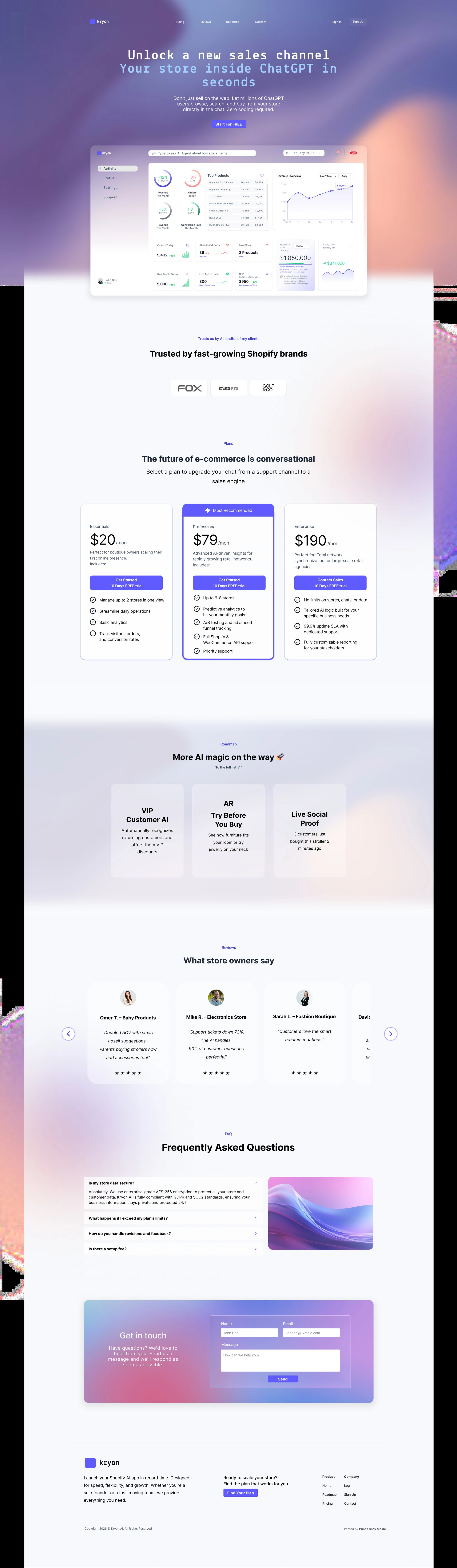
Where it all starts: the pitch and the “Get Started” door.
Kryon lets store owners open an in-chat app, a store inside the ChatGPT conversation, so the millions of people already chatting can browse, search and buy without ever leaving the chat.
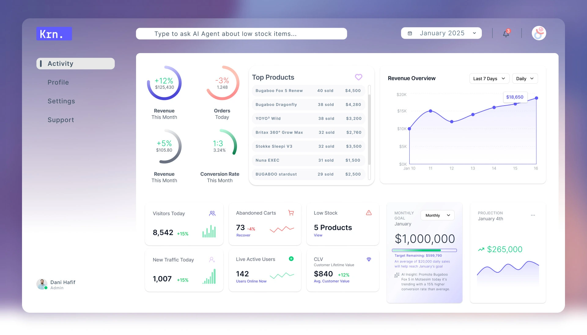
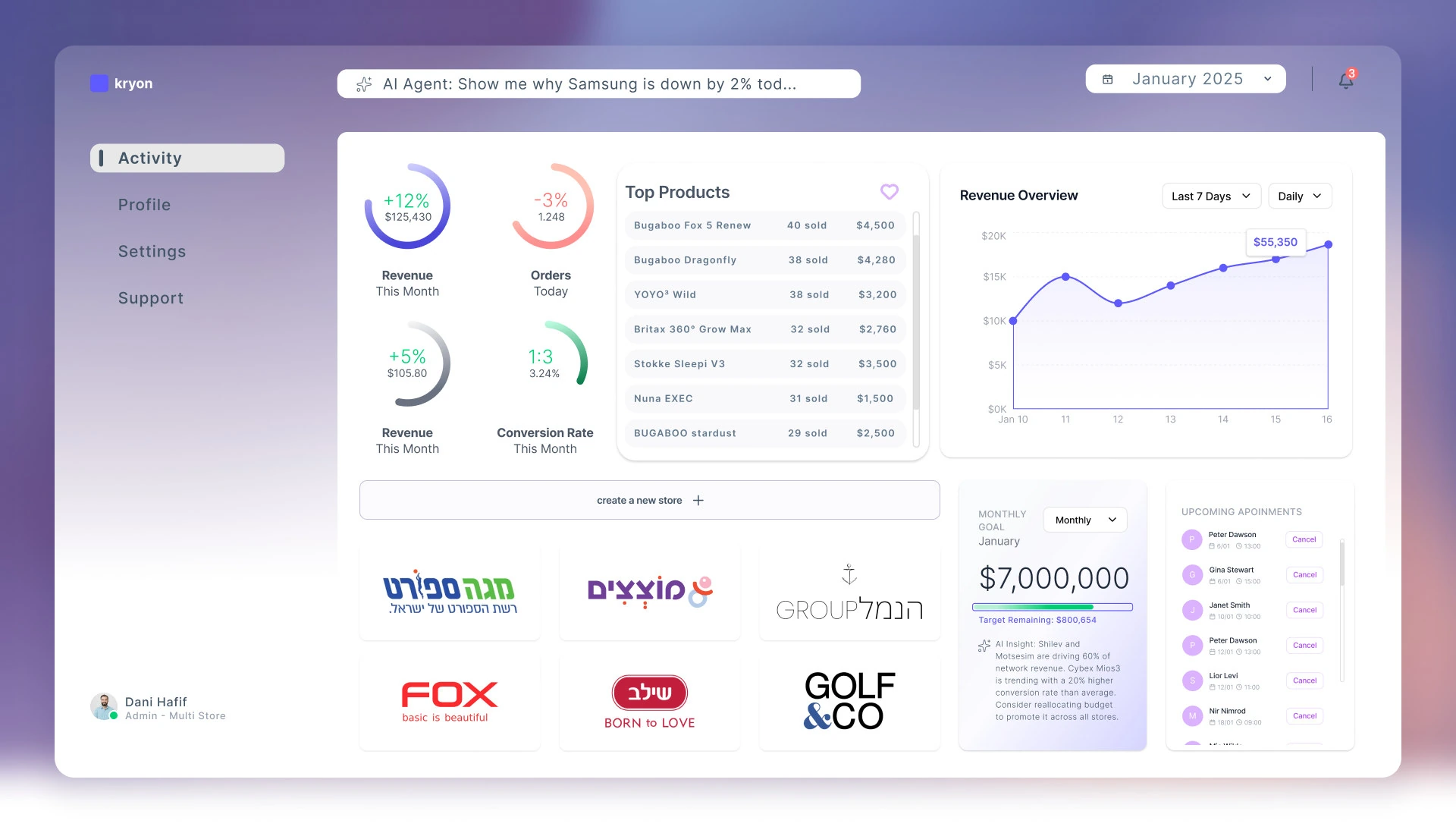
Owners connect a store in seconds (no code), and get an analytics dashboard on everything happening in-chat: searches, add-to-carts, conversions and revenue, across one store or an entire network.
My role: end-to-end product design: positioning, the conversational onboarding, information architecture, the single- and multi-store dashboards, a full design system, and a clickable prototype.
Shoppers increasingly start with a chat, not a search bar. But getting a store into that conversation normally means developers, product specs and months of work, out of reach for most store owners.
The opportunity: let any owner plug their catalog into ChatGPT in seconds, and prove the value with clear, real-time analytics. The challenge: make something this novel feel simple, trustworthy and obviously worth paying for, whether it is a boutique owner or a multi-store agency.
Every decision starts from the store owner's goal: more sales, less effort, total clarity.
Meeting commerce where attention is moving: inside the conversation itself.
An AI agent that doesn't just sell, but surfaces insight: low stock, top products, what shoppers ask for.
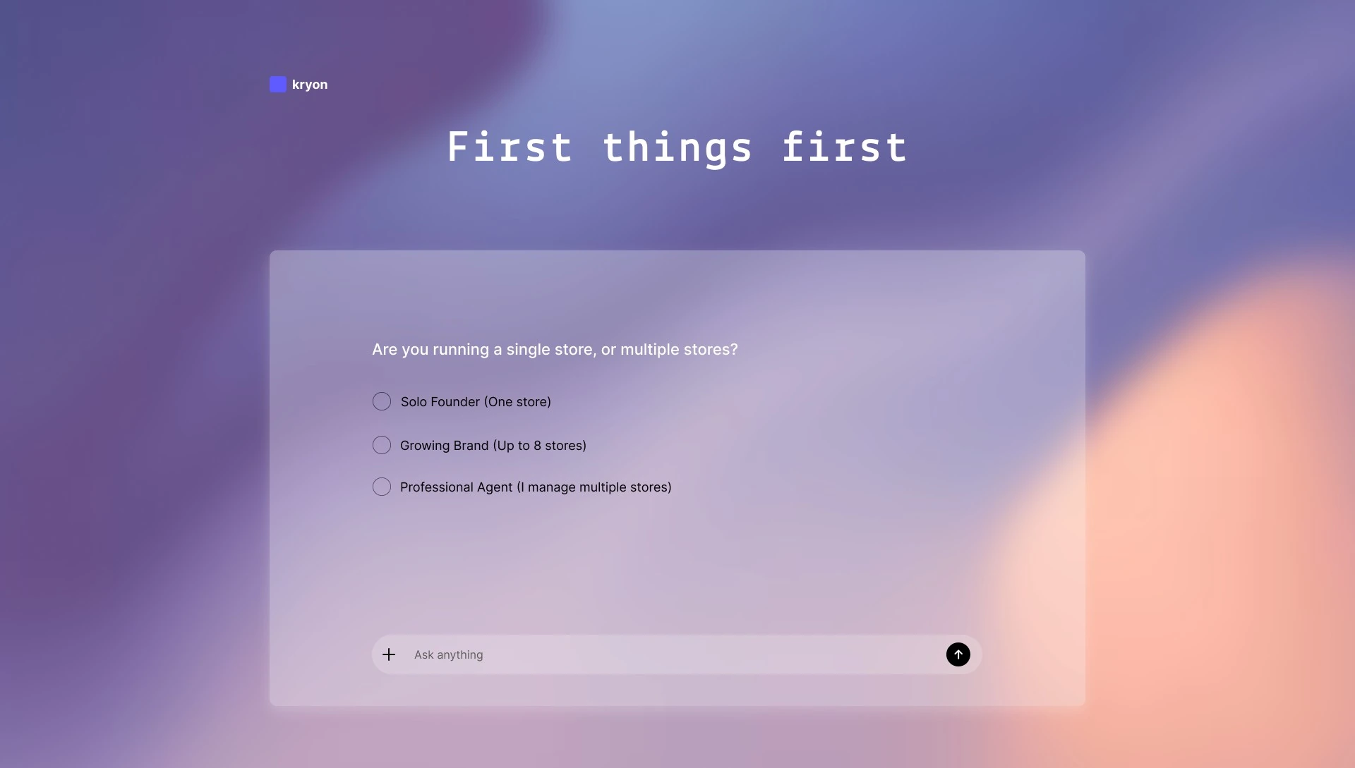
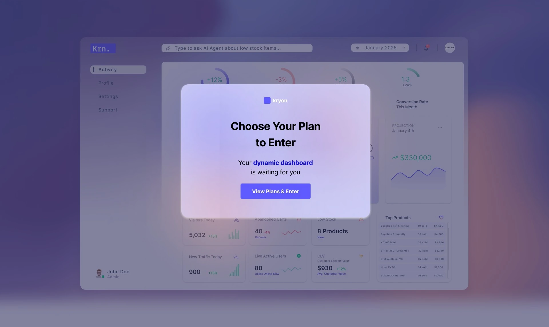
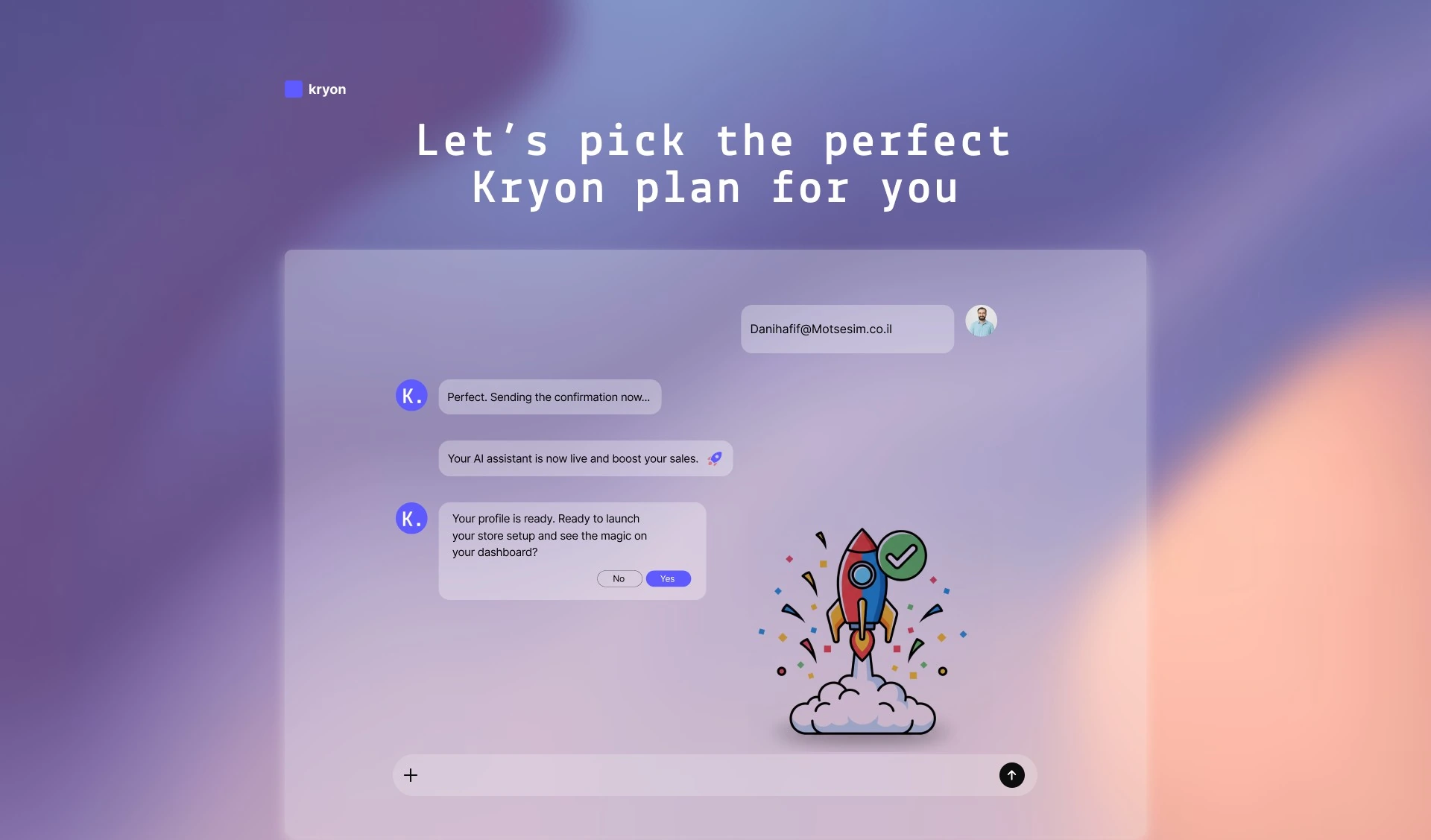
A store owner goes from landing page to a live, analytics-rich dashboard, most of it as a guided, conversational flow.
Hover a step to lift it · click any step to jump into the live prototype above.
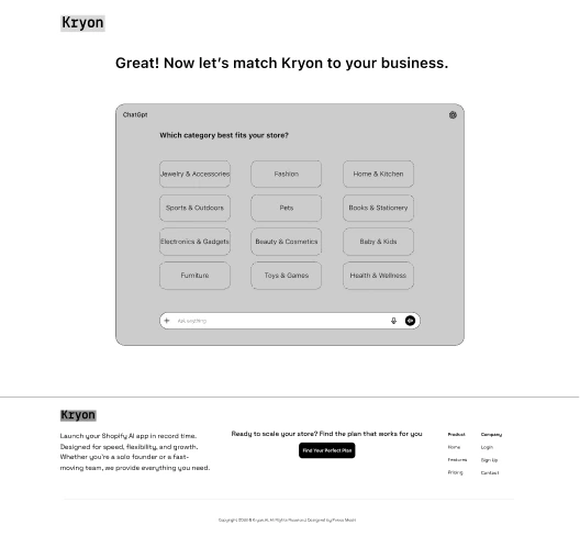
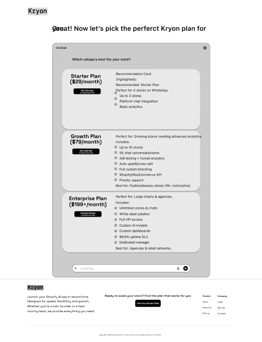
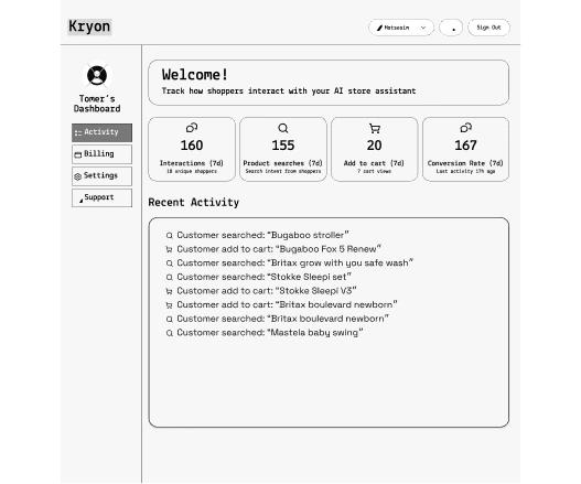
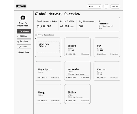
I started in Figma with fast, grayscale wireframes that locked the information architecture of the onboarding and the single- and multi-store dashboards before any visual design. These first frames set the layout logic that the final, brand-styled product grew from.


Kept deliberately raw: black & white, system type, zero colour, so every early call was about structure and flow. Compare the network frame above with the live coded dashboard it became.


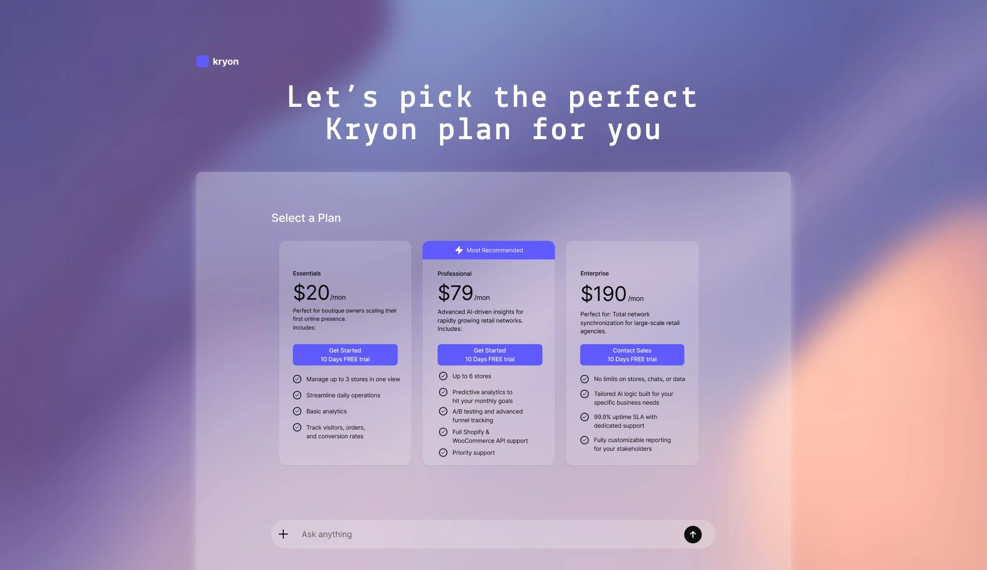
Three tiers, from a boutique's first store to an agency running a whole network, all starting with a 10-day free trial.
Electric indigo on deep space-blue, soft gradients and glow, a techy mono headline (Lekton) paired with clean Inter. The brand feels like the cutting edge of commerce, while the product dashboards stay bright and readable.
How it's used: indigo drives every primary action and highlight. Teal is reserved for positive signals (growth, live, success), and the deep-blue neutrals keep dense, data-heavy dashboards calm and readable.
Mono-flavoured headlines & numerics give Kryon its technical, AI-native voice.
Body copy stays calm and legible at small sizes across dense, data-heavy dashboards.
How to use: one primary style (the indigo gradient) so the main action is never ambiguous. Ghost buttons carry low-emphasis or destructive actions. Sizes step down from hero CTAs to in-line chips while radius, weight and gradient stay constant.
How to use: each ring turns a single metric into a glanceable status. The arc shows progress to goal, the colour shows direction (teal up, coral down). Reused across every dashboard tile so owners read performance at a glance.
How to use: a plan card and the AI-agent input are the two moments where the product asks for a decision. Both reuse the same radius, gradient and spacing tokens so a new surface always feels part of Kryon.
How to use: a small kit of data-viz marks (bars, sparklines, trend arrows and live dots), kept to one colour per state so charts read instantly: green for healthy and growing, coral for a drop that needs attention.
Kryon meant designing for a brand-new surface (commerce inside an LLM) with no established patterns to lean on.
A conversational onboarding made a radically new product feel familiar, and the dashboard turned an invisible channel into something measurable and trustworthy.
Usability testing on the “connect your store” step, and validating which metrics owners actually act on day-to-day.
The same analytics layer scales from one boutique to an agency's whole network, and to new conversational surfaces beyond ChatGPT.